
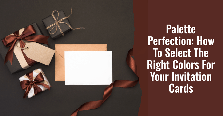
Colors have meaning. Colors communicate something special and specific. This is why you can’t just wake up and pick any color you feel like for anything you are working on. This is especially when doing invitation cards for something special like your wedding.
While we can all agree that colors must be chosen carefully, it is clear it is a challenging task. Most people are subjective about their color preferences, making it even more complicated. But you don’t have to enter into that fuss and dilemma. Professionals always seem to get it right, and their secret is not such an esoteric invites-only affair.
What is their secret?
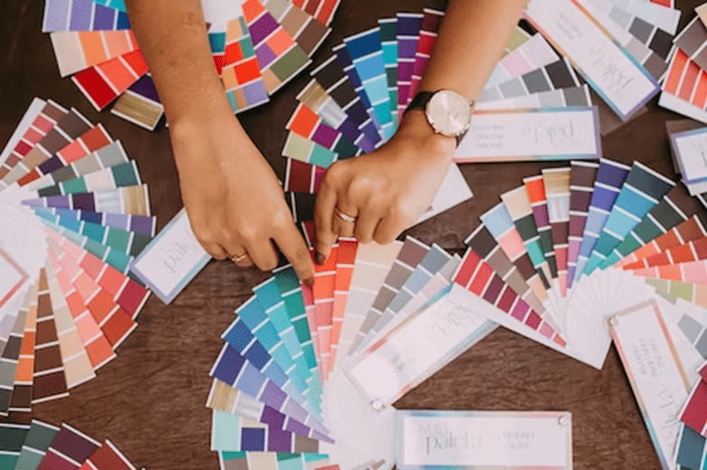
Experts know how to play with the color palette—a spectrum of hues displayed on an interface or an assemblage of colors and implements for paint and graphic illustrations.
Selecting The Right Colors For Your Invitation Cards
Here are some of the tried and true tips that can help you select the right colors for your invitation cards:
1. Hire Experts

The DIY approach can work perfectly when choosing colors for your invitation cards. Unfortunately, this may not work well for you if you don’t have time for all that experimentation you might need when doing it yourself.
With your wedding approaching, you only need sure bets and absolute perfection. This is where you need to appreciate and transfer the assignment to the experts to have the job done for you.
Color palette experts like www.kiasuprint.com will help you find the right colors for your wedding. With their long-term experience in dealing with colors, they will give you a touch of professionalism and blue-ribbon expertise. You only need to share your wedding theme colors and let them handle everything, giving you several samples.
Transferring the burden of invitation card color choices to experts is the best and safest way to get the best.
2. Settle on One or Two Main Hues
Incorporating too many colors often leads to overdoing your hues. Unless you are trying to create a rainbow, limit your main hues to one or two. Too much color makes it hard to establish uniformity and perfect design. Multiple colors become a huge problem, especially if you are considering a do-it-yourself approach without considering professionals.
Reducing your main colors to one or two is a perfect way to achieve the right colors for your invitation card. The main color or colors should reflect the theme colors of your wedding so that you maintain uniformity all through.
If you have two main colors, you should use them complimentarily in a balanced outlay to bring out the right effect. Otherwise, if you have only one, your work is even easier. Building everything around it will give you top-class elegance.
3. Add an Accent Shade
Accent colors or shades are the icings on the cake. Accent colors are peripheral shades that usually contrast the fundamental pigments in a work of art. The main purpose of accent colors is to emphasize, enhance a color idea, or add embellishment to an otherwise dull space.
Accent shades create an outstanding stamp on otherwise monochromatic space to make things more stirred up.
If you are creating your wedding around white or cream colors, a drop of midnight blue would be a perfect example of an accent shade. Accent shades can come in natural elements that stand for specific things. Something like ocean blue will bring many calming effects to the entire color idea. Forest green with some evergreens drawn subtly and carefully will provide a good accent of green.
4. Utilize Your Color Palettes on Card Elements
Established Color palettes provide you with wide freedom to play out with elements. To use these successfully, you must be exposed to various ways of appreciating the color schemes on a color palette wheel. Some colors work well with specific shades and not all colors.
Most professionals use an established way of combining colors when it comes to appreciating the color palette. With a color wheel as the reference point, you can consider multiple patterns, including complementing colors (colors stationed opposite each other) and triadic patterns( any three colors equidistant from each other).
Appreciating the laws of applying palette pigments is a safe way to avoid color clashing or simply overdoing colts which can be a lovely combination when done correctly.
Utilizing color palettes on the various elements of the card makes a huge difference in making the card beautiful and well thought of. Various card elements, including the header, background, and foreground, are chances to utilize your chosen palettes.
5. Match With the Wedding Theme Colour
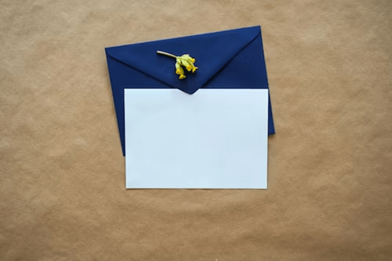
Finally, you can also match your card with the wedding theme color. When you hear matching, you are tempted to think of uniformity and similarity, right? You are right. However, it can go further than that. Think of having a different color that matches well to form an amazingly beautiful combination.
Colors like burgundy and midnight blue are great compliments. Matching them complementarily is a winning color idea for your wedding card. If your wedding theme is blue, your card can come with burgundy as the main color, and all is well.
Conclusion
Settling on the right color for your invitation cards is a complex task. It becomes worse if you have to do it alone and are not quite apt with colors. Hiring professionals can help you transfer the assignment and get top-quality.
Otherwise, you can do it yourself and get the best by limiting your primary hues to one or two and subtly including an accent shade.

